Type Through the Decades
Overview
In Typography 2 we did a six week project over typography through the decades. We were tasked with researching a specific font within decades ranging from the 1910's to the 1990's. Each week starting from the 1910's we hand lettered a design that correlated with what we chose to represent that decade.
Process
I chose to use song lyrics from each decade we were studying to influence my designs and create the physical type that I would used. I then researched a font from within the decade to incorporate. I used Procreate, Adobe Illustrate, and Adobe Fresco to hand letter and illustrate my designs. I tried to incorporate popular songs from the decades to influence my drawings and put a fun twist on how the fonts were portrayed.
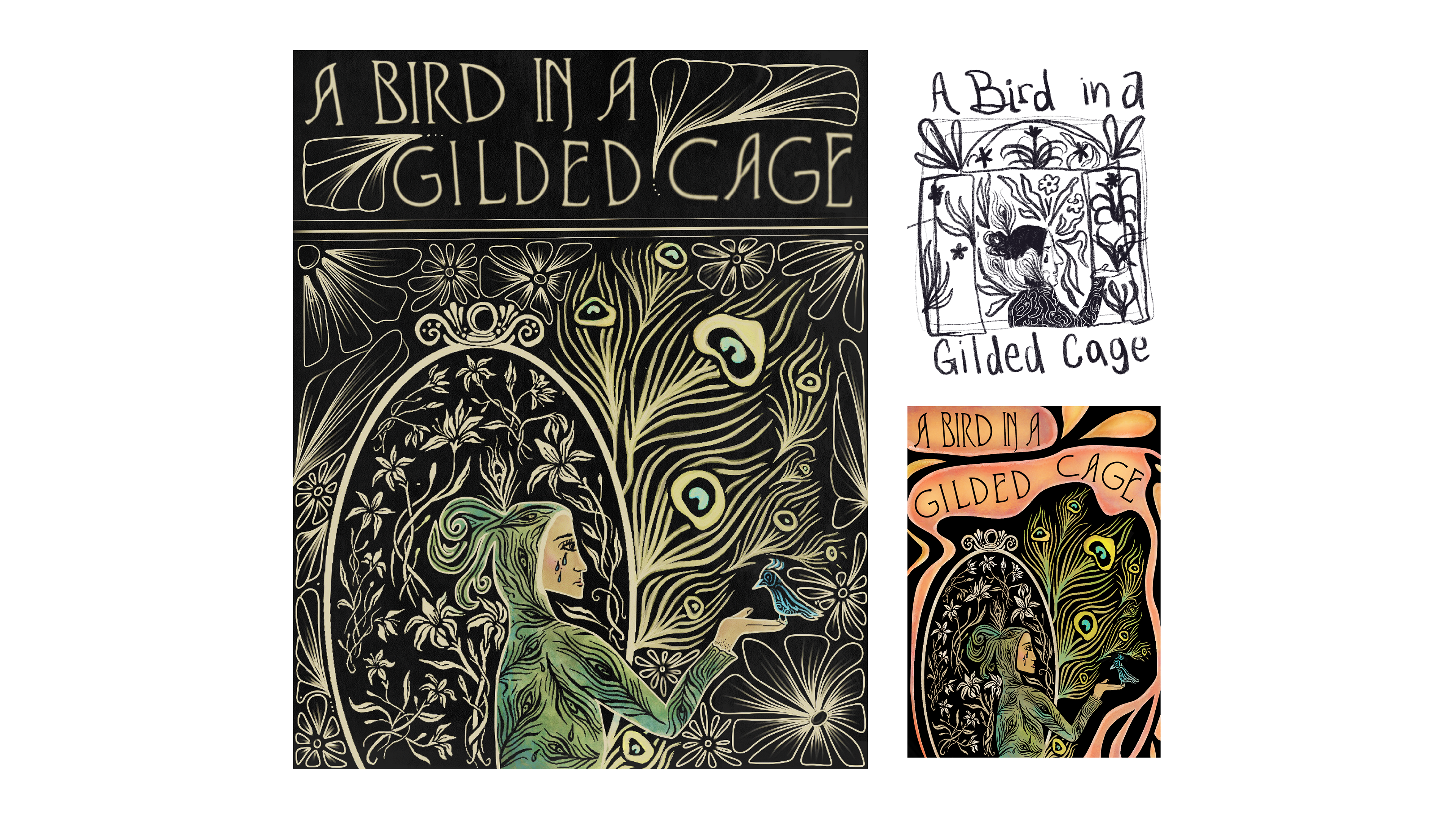
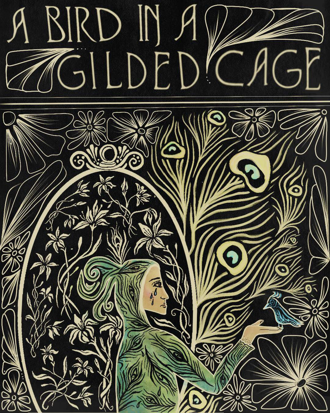
1910's
Font: Virgin Roman Normal
Song: A Bird in a Gilded Cage
Style: Vienna Secession
As the beginning of Art Nouveau style grew another style, Vienna Secession which became popular, and women were portrayed in new ways. Their form was idealized and displayed amongst nature elements and in a more whimsical and flowing style. The female form was at the center and was used to evoke emotion and a sense of fantasy. I used the type face Virgin Roman Normal. It was published in the 1910’s and was a thin and clean type that still has stylistic elements that fit in with the Vienna Secession that it originated from. I chose song lyrics to relate the type to the time period and represented it through the imagery I created. The song, "A bird in a Gilded Cage" was written in the 1910’s by Harry Von Tilzer. The song talks about a women marrying for economic freedom instead of love, and how she lives in a world of luxury, but lacks true freedom. This goes in hand with how class divisions grew and marriage became more of an economic preposition within this time period.
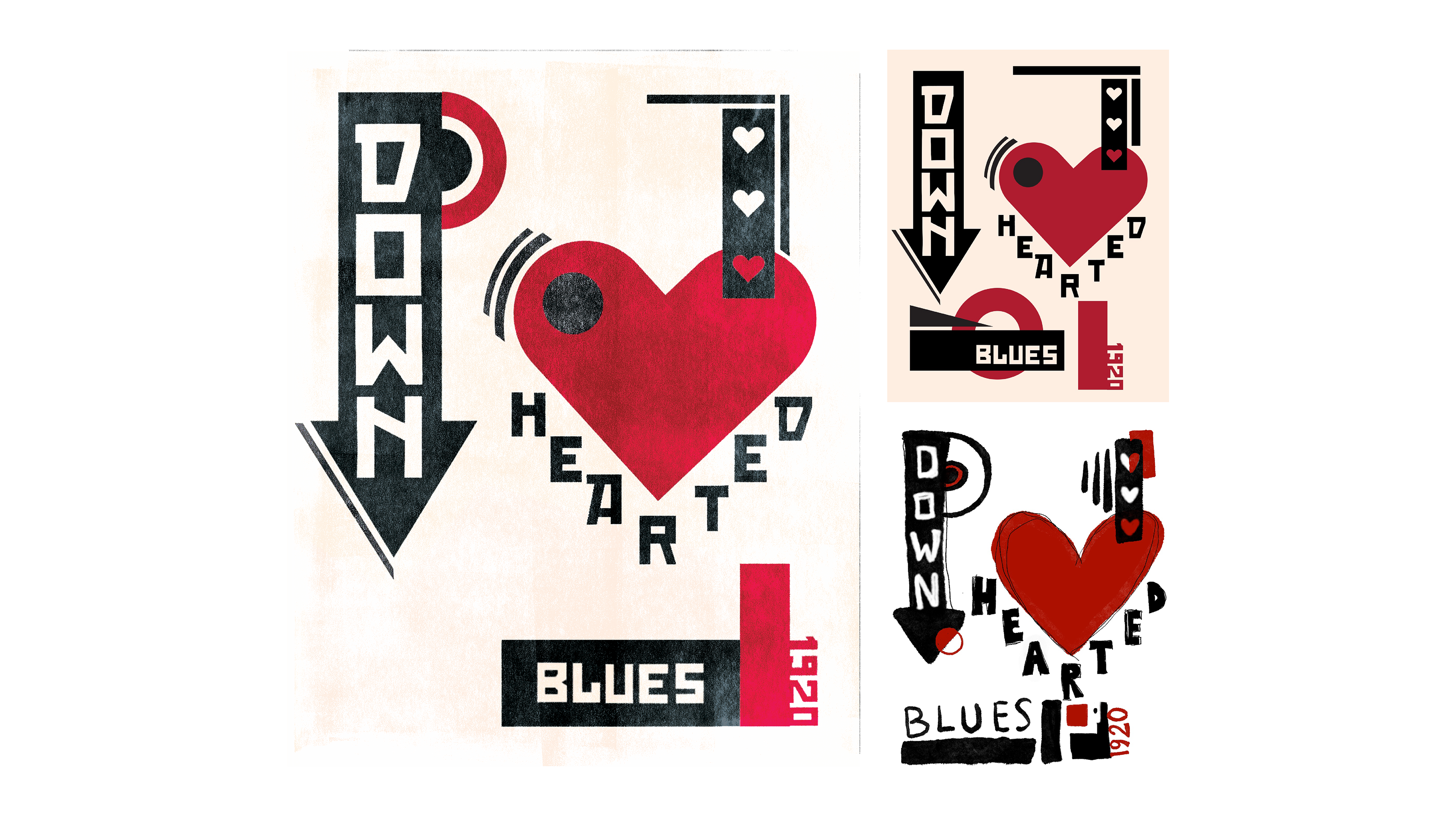
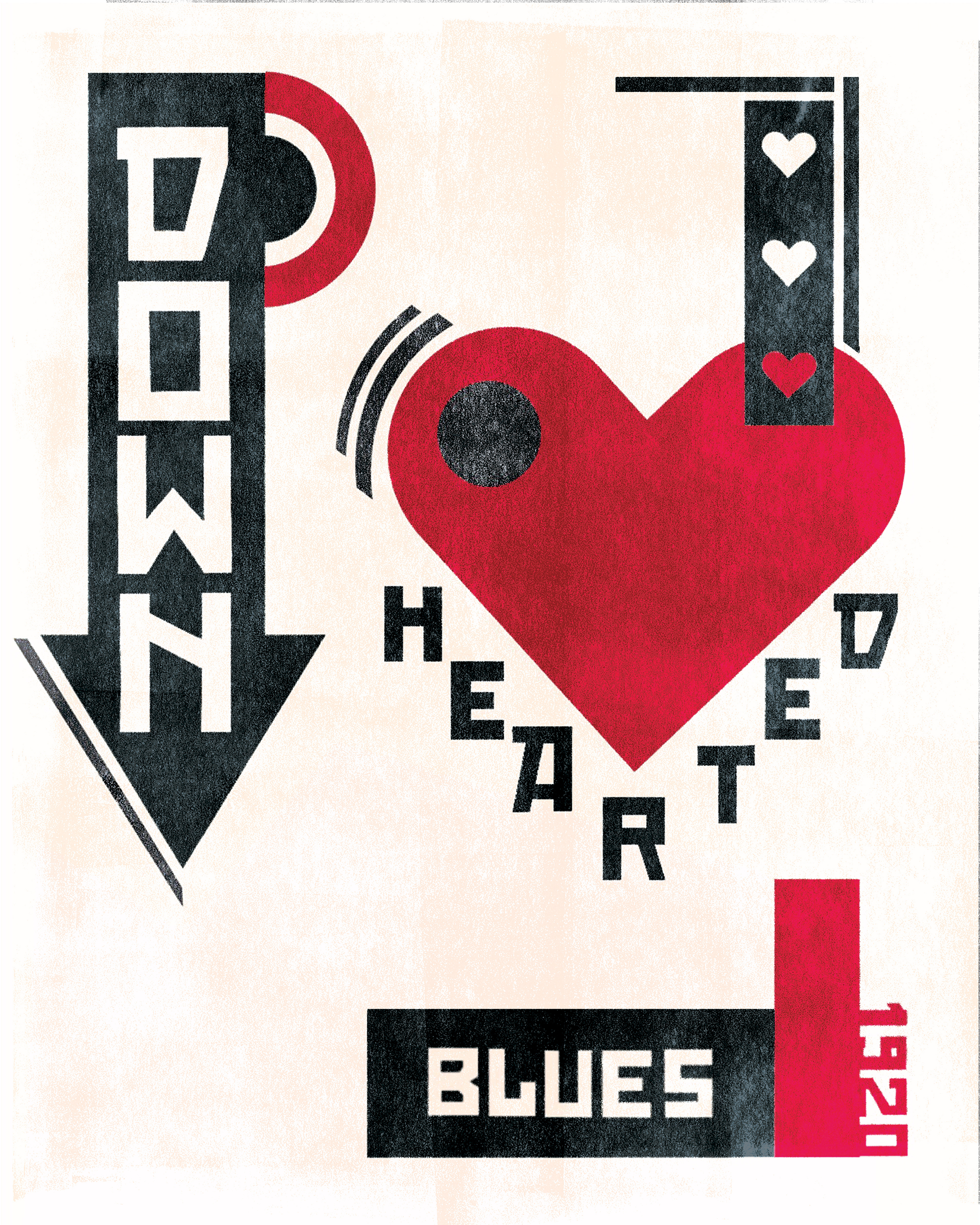
1920's
Font: Red October
Song: Down Hearted Blues
Style: Constructivist
The style I used is Constructizvism and I wanted to contrast the usual serious and political message with softer song lyrics that give a new tone to Constructivist style. Many of the Constructivist designs are focused on industrial production. Applications also combined elements of 3D cubism and non-objective elements of straight lines and merging elements. The song I chose for the 1920's is down hearted blues by Bessie Smith, who was an influential figure during that time. She was the highest-paid African American artist working in music during that time and the first African American superstar. This was during a time of dramatic political and social change in the United States. I am using the font Red October by Neogray Creative which is a blocky display font with fat width and Russian influence. The font was created in 2008 however it is from the exact style of the Constructivist era.
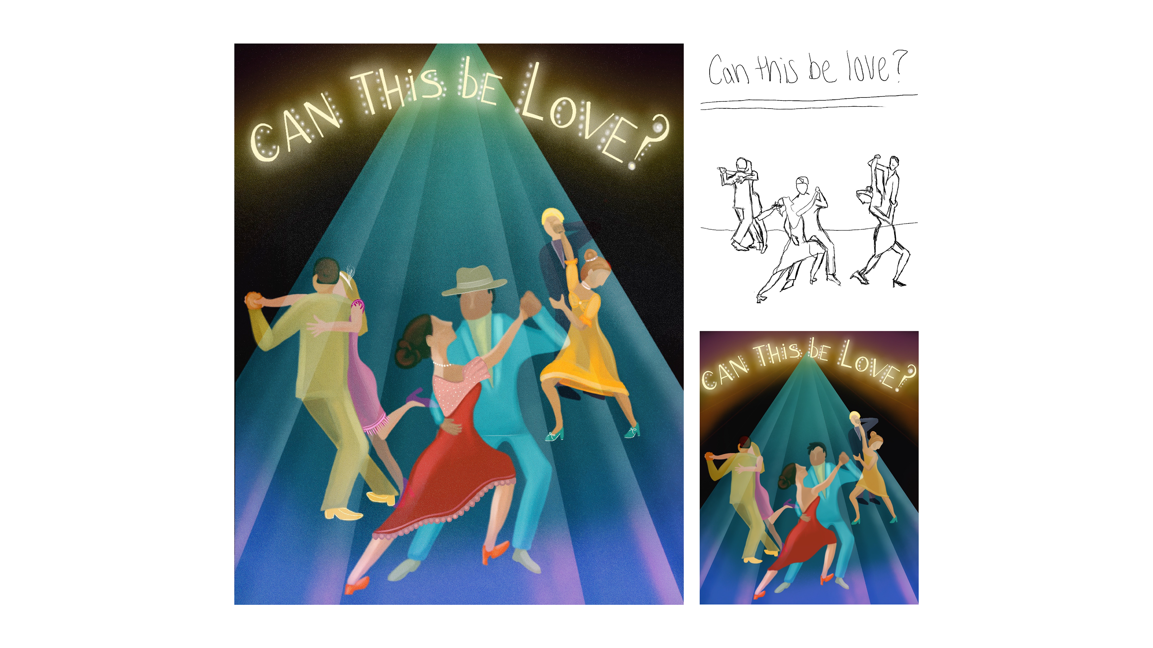
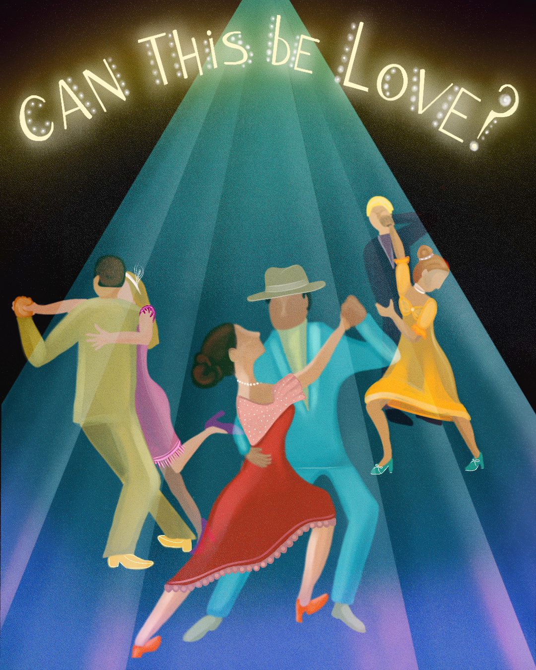
1930's
Font: Peignot
Song: Can this be love?
Font: Virgin Roman Normal
The song from the 1930s that I chose to represent is "Can This Be Love?" By Paul James m. The 1930s were a time of blues and the rise of swing. New innovations in film and radio allowed for a growth in music and the arts because it became more accessible for more people. The 1930's were also a time of fresh talent and experimentation, because previous styles were very conservative. The introduction of the Art Deco style brought excitement into the design field as well as unique artistic style on a commercial level. I used Peignot font which was created in 1937 by A.M. Cassandre. I incorporated it as a more seamless integration into the piece, which is what many art deco artist tried to do. The font is unique because it has “multi-case” which combined traditional lowercase and small capital letters. The type face was popular in posters and advertising during this time.
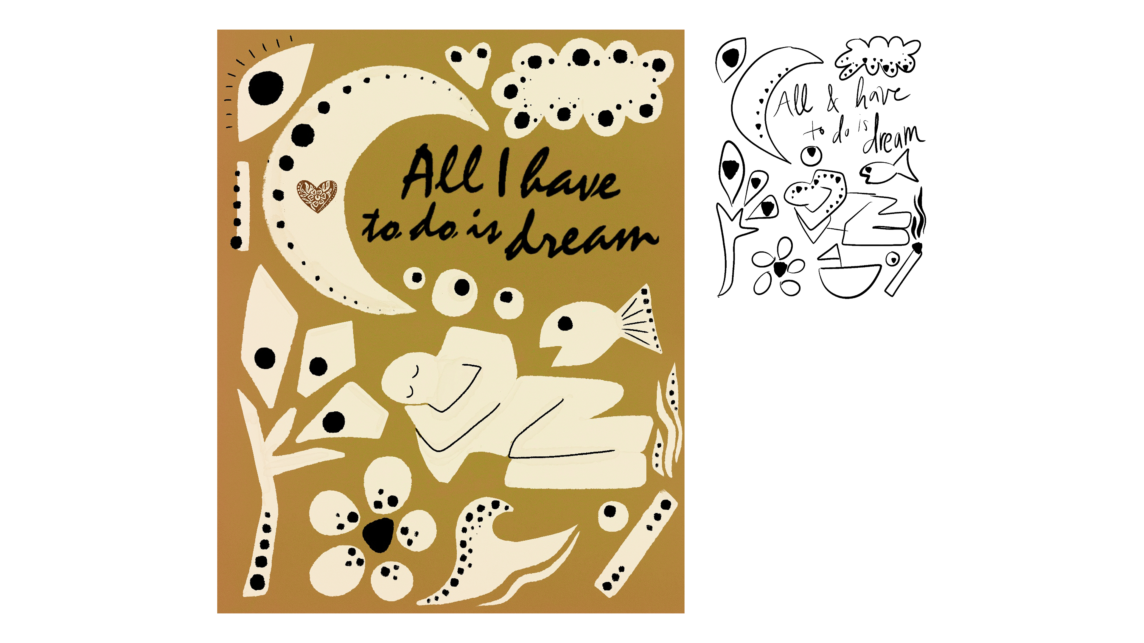
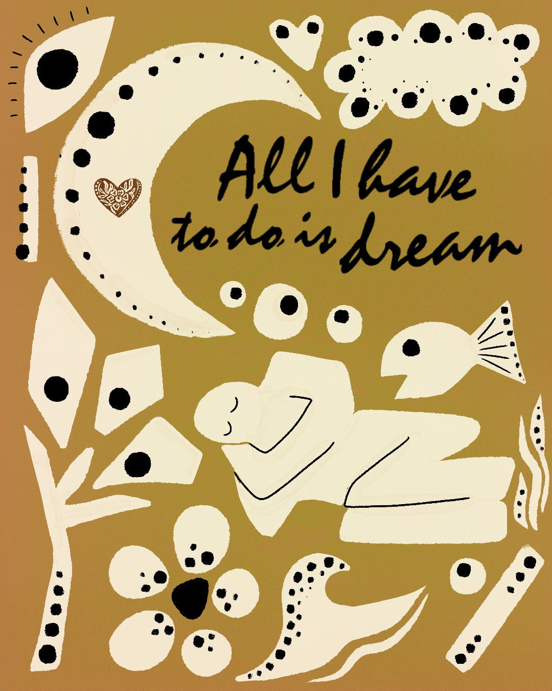
1950's
Font: Mistral
Song: All I have to do is dream
Syle: Inspired by Paul Rand
The song i chose to do this week is “All I have to do is dream”. It’s a song from the 1950s by the evenly brothers and was created in an era of great musical accomplishment and a time of political strain as communism and capitalism went head to head in America. In design, a new American advertising style emerged and one of the greatest artist that emerged was Paul Rand. My post is inspired by Paul Rand, whom introduced modernist styles to America. His designs were in Swiss style but he often used wit in design. I am using the font Mistral, which was created in 1953. The creator Roger Excoffon based the form on his own handwriting. This font matches the sketchy handwriting that Paul Rand often used on some of his designs and has an informal graphic quality similar to a brush.
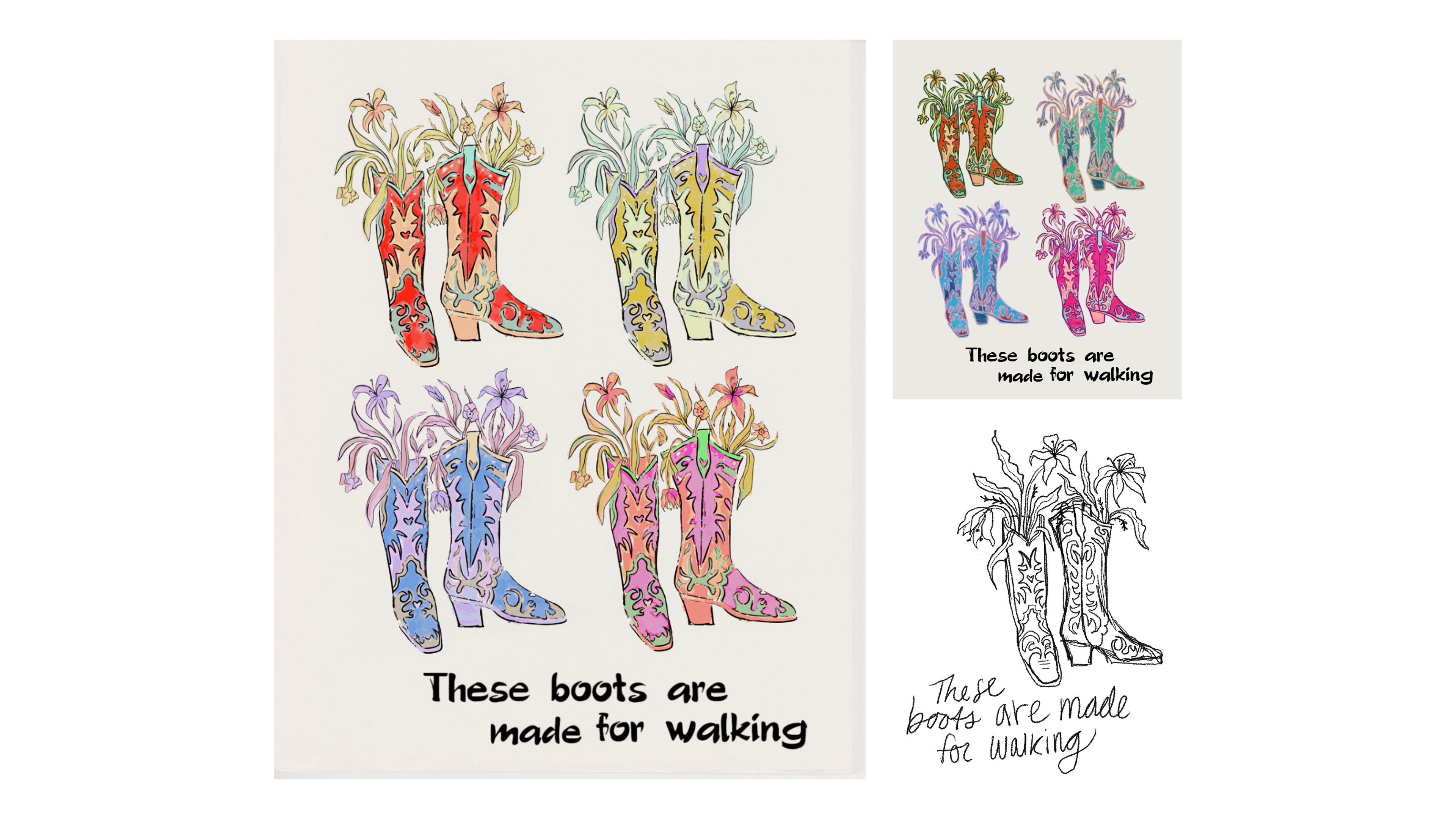
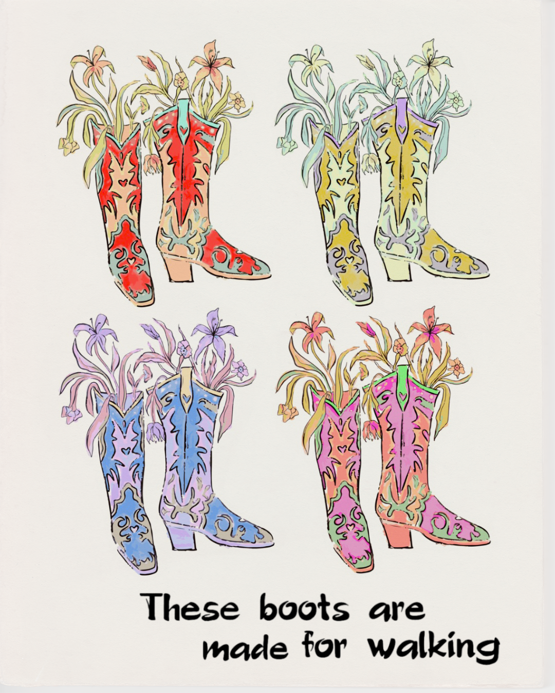
1960's
Font: Polo
Song: These boots are made for walking
Style: Pop art
The song from the 60's that I am doing is "These boots are made for walking". This piece was created in Pop Art style with inspiration from Andy Warhol. The style is very colorful and includes different variations of the colors applied to different subjects. Also, some pop art works had a sense of irony and I tried to incorporate that into my piece. The font that I am using is Polo, which was created by Carl Rudolph Pohl and Ralph M Ulger in 1960. I chose this font to mimic the sketchy handwriting often used Warhol’s pieces.
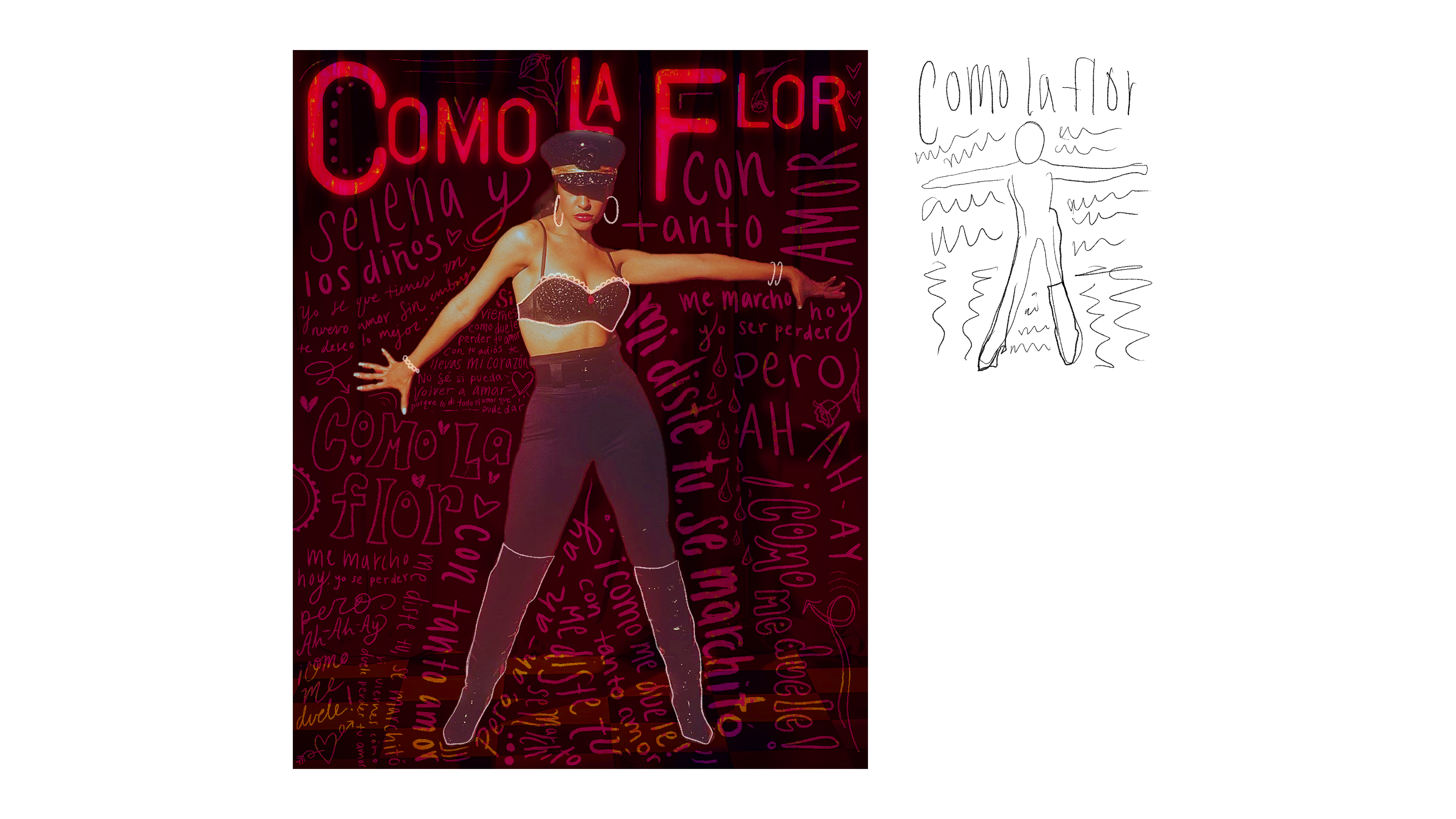
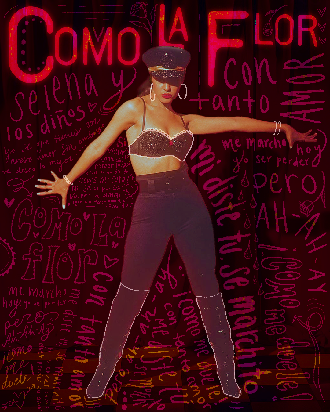
1990's
Font: Template Gothic
Song: Como lo flor
Style: Handmade
I chose the song "Como La Flor" by Selena. I wanted to go for the "Handmade" technic so I tried to embrace new and old technologies, similar to designers in the 90's. During this time many designers felt that designs were becoming homogenized by technology and lacked a concept. I used the font Template Gothic for the heading of my design. This font was released in 1991 by Emigre type foundry, and was created by Barry Deck. The rest of my design I used my own handwriting, which is something many designers did in the 90's to get the homemade feel.
These designs were created for a class project, with no affiliation to the artist involved.
All images, logos, products, videos, and other copyrights or trademarks featured, mentioned, or referred to within the project are the property of the artists. The use of the trade name, copyright, or trademark in my student portfolio for identification and reference purposes only and does not imply any association with the copyright or trademark holder of their product or brand. My work is not affiliated, associated, authorized, maintained, sponsored, endorsed by, or in any way officially connected with these copyright or trademark holders. These artist do not sponsor or endorse any of the shown work. I declare no affiliation, sponsorship, nor any partnerships with any copyright or trademark holders.